Understated and Neutral
This classic olive green tone has evolved through decades and quite possibly centuries. It’s timeless, elegant, luxurious, natural and retiring. This colour is perfectly offset in these images by black and white, wooden materials or earthy ceramics .
.avif)
Each of us seeks to thrive in our everyday lives. Color can be one of the simplest and most effective routes to creating an environment that inspire us.
Warm and Inviting
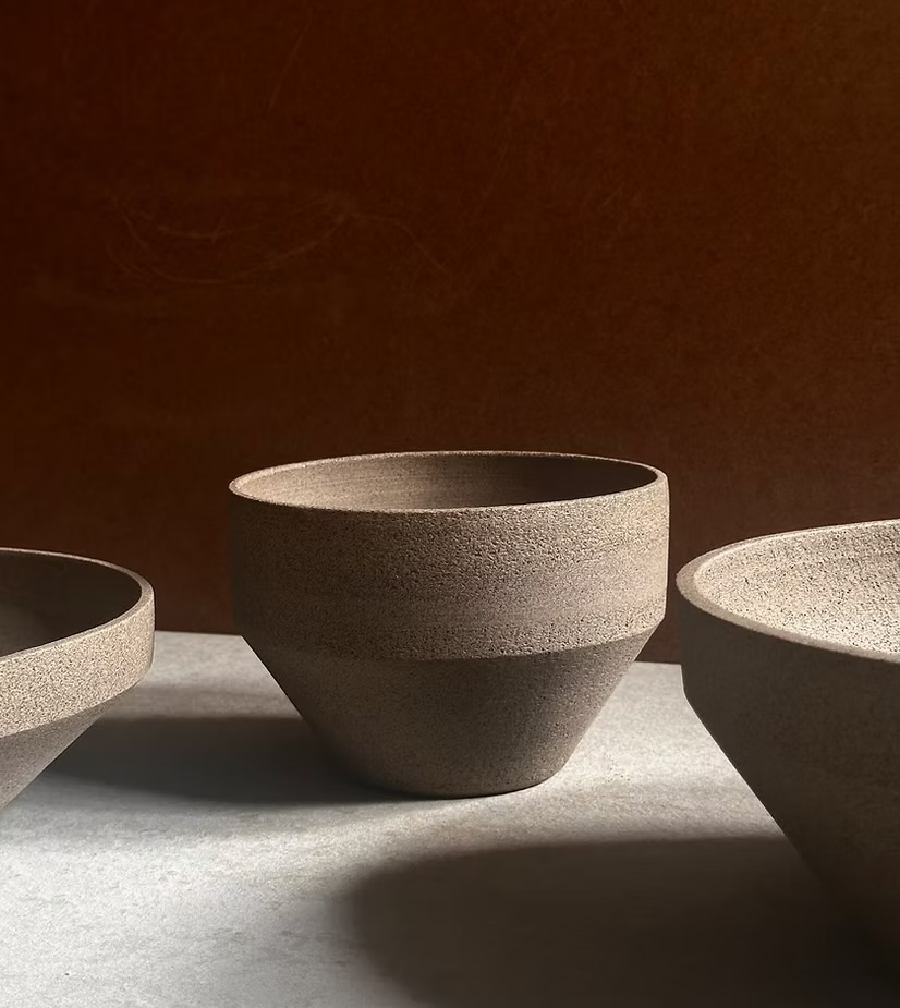
Last year we featured a colour like this in the gallery from Dulux ‘Auburn Flair’ which was close to this baked red from Jotun. It speaks of places to travel to like Morocco and it’s fitting with the other tonal beige and greens to once again remind us of the earth.

Tonal and Calming
Keeping up with the world around us requires a return to the calm and quiet of a living space which is personal and inviting. The simplicity of a tonal palette combined with plush or natural fabrics and materials from nature – sisal, paper, wood, cane and rattan – reconnects us with slow living.


.avif)
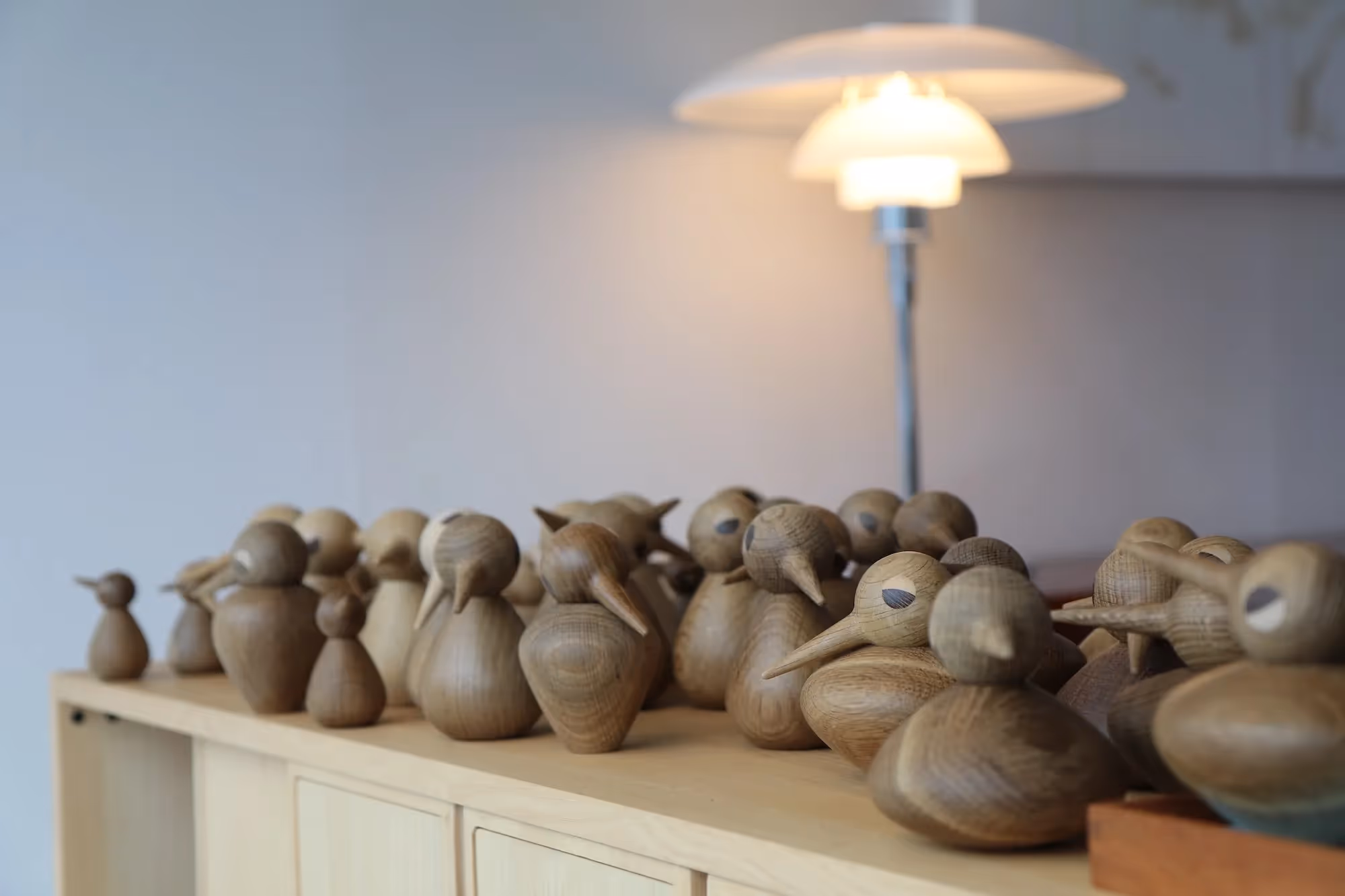
Sculptural and Organic
These cool tones evoke more of a Japanese element, a neutral palette that fits with ultra modern spaces or character homes. The interchanged glossy and matte objects, textured details and sculptural statement pieces add depth and contemporary flavour.
.avif)
The colours and images from Jotun on the whole embrace the rawness and honesty of the natural world. They create spaces which encourage engagement and experimentation.
.jpg)